Download the alternative format
(PDF format, 45 KB, 9 pages)
A “PivotTable® is an interactive table that automatically extracts, organizes, and summarizes your data. You can use this to analyze the data, make comparisons, detect patterns and relationships, and discover trends” (Microsoft Corporation, 2014).
Objective:
This exercise will use an outbreak line list to build PivotTables, extract descriptive epidemiology statistics from those PivotTables, and create epidemic (epi) curves.
- Part 1: Building the PivotTable
- Part 2: Descriptive summaries using PivotTables
- Part 3: Creating an epi curve
Before you begin, any data set you use to create a PivotTable or Epi Curve must be “cleaned”:
- Data entries should be consistent; choose a single way to represent your data:
- 1, one, or 1.0
- MALE, Male, male, or M
- Cells should contain no spaces
- Blank rows and columns should be removed
- Column titles should appear across a single row
For this exercise, you have been provided with a “cleaned” line list. File name: Module 2 – Line List.xlsx
Part 1: Building the Pivot Table
1. Retrieve the file Module 2 – Line List.xlsx and save a copy to your desktop. Open the file from your desktop.
2. Select any cell (Excel will automatically determine the range required for the PivotTable based on the data), or highlight the range of the data you want to include in your PivotTable.
3. Microsoft Excel 2007–2010: In the Ribbon menu, select the insert tab and click on PivotTable.
(in earlier versions, Microsoft Excel 2003/XP/2000/97, select Data > PivotTable and Pivot Chart)
4. In the Create PivotTable window, two options must be selected:
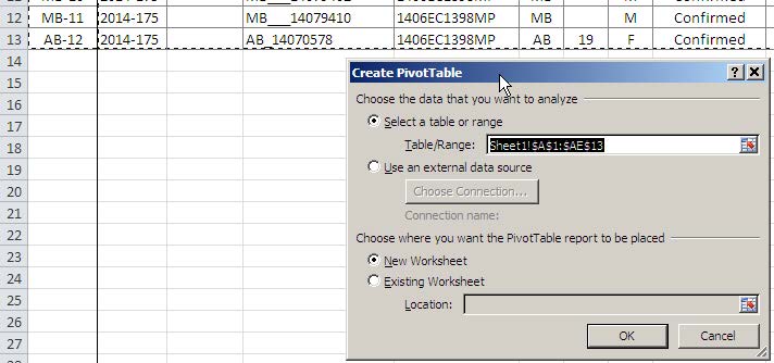
- Select the data that you want to analyze: By default, Excel will select the data in your excel sheet and outline it with dotted lines. If the Table/Range is different from what is selected by the dotted lines, you can click on the expand icon and select a new range.
- Select where you want the PivotTable report to be placed: By default, the chart/report will be placed on a New Worksheet. If you wish to change this, select Existing Worksheet, and once again, use the expand icon can to choose a location on an existing worksheet.
- Click OK.
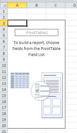
5. You will notice four new features: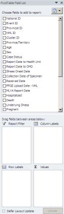
- A new worksheet where the PivotTable has been placed – Sheet 4 (if the New Worksheet option was selected).
- A new set of options in the ribbon – PivotTable Tools.
- An empty PivotTable that will be used to build a report.
- A side pane – PivotTable Field List (lists all column titles from the linelist).
There are two sections in this pane:
- A field section (at the top) for fields to be added and removed from the PivotTable.
- A layout section (at the bottom) for rearranging and repositioning fields.
6. Click on a variable from the PivotTable Field List that has an entry for each case (e.g. National ID), and drag and drop it into the Values field. The empty PivotTable will now show: Count of National ID = 12.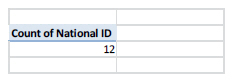
Note: If you select cells outside of the PivotTable, the PivotTable Field List will disappear. To view the field list,click any of the cells that contain the PivotTable on your worksheet. The side pane will appear.
7. Now, drag and drop the Sex variable into the Column Labels. Try dragging the same Sex variable from the Column Label and drop it into the Row Labels. With either, you should see 6 Males (M) and 6 Females (F). Now, drag the Sex variable back into the list (or simply, unclick the variable in the list) to remove it from the PivotTable. You should see the Count of National ID = 12 again.
8. Repeat step 7 using different variables and play around with the PivotTable, moving different variables into different labels. Try adding two variables, and then three, etc.
Note: A variable can only be added once to either the Report Filter , Row Labels , or Column Labels areas.
Part 2: Descriptive summaries using PivotTables
Note: Uncheck all variables in the PivotTable Field List before you begin each section.
Section A: Number of Males and Females
1. Clear the PivotTable.
2. Drag and drop the following variables into the respective Labels:
- National ID > Values
- Sex > Row Labels
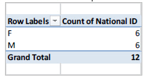
There are 6 Females and 6 Males in this cluster – total of 12 cases.
Section B: Number of Cases in each Province/Territory
1. Clear the PivotTable.
2. Drag and drop the following variables into the respective Labels:
- National ID > Values
- P/T > Row Labels
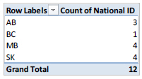
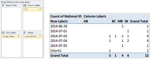
Case counts by province: AB=3, BC=1, MB=4, and SK=4.
Section C: Earliest and Latest Illness Onset Dates
1. Clear the PivotTable.
2. Drag and drop the following variables into the respective Labels:
- National ID > Values
- Illness Onset Date > Row Labels
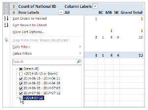
3. In the PivotTable, select the Drop Down menu beside the Row Labels, and Sort Oldest to Newest.
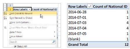
The dates range from 2014-06-28 (earliest date) to 2014-07-05 (latest date).
- There is 1 case with an onset date of June 28;
There is 1 case with an onset date of July 1;
There are 4 cases with an onset date of July 3;
There are 4 cases with an onset date of July 4;
There is 1 case with an onset date of July 3;
And 1 case with (blank) onset date – with a grand total of 12 cases in the cluster.
Section D: Average, Median, Maximum and Minimum using Age
- Clear the PivotTable.
- Drag and drop the following variables into the respective Labels:
o National ID > Values
o Age > Row Labels
This shows you the number of cases (count) for each age.
Two cases do not have age information: (blank).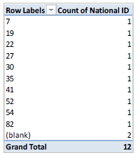
You can also easily view the Average, Maximum, and Minimum ages using PivotTables.
3. Clear the PivotTable again.
4. Drag and drop the following variables into the respective Labels:
- Age > Values
The Count of Age = 10; there are 10 cases with Age information – there were 2 cases with no Age information – see above: (blanks)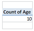
5. Select the small black arrow beside the Age variable in the PivotTable Field List and click Value Field Settings…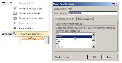
6. The Value Field Settings window will appear, and under the Summarize value field by section, there are options to choose. By default, variables are summarized by Count.
To determine the Average age of the cases, or the Maximum/ Minimum age, choose the respective type of calculation to summarize your data. Each time, following steps 5 and 6.
The average age of the cases = 36.9 years old
Part 3: Creating an Epi Curve
Note: Multiple worksheets with PivotTable Reports can be made using the same data set. The previous sections were all done using one PivotTable chart. It might be useful to create a new PivotTable to create the Epi Curve.
1. Follow steps 1-5 in Setting up the PivotTable.
2. Next, follow steps 1-3 in Section C: Earliest and Latest Illness Onset Dates
3. Finally, drag and drop the variable P/T into Column Labels.
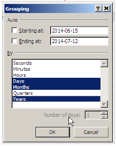
4. Right-click on any of the dates in the PivotTable, and select Group…
5. In the Grouping window, the default starting and ending dates are automatically chosen based on the data and the By option is defaulted to Months. These can be modified as needed.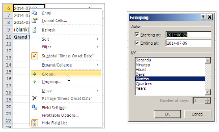
6. June 28, 2014 (the default starting date) is a Saturday. It is best to start the Epi Curve at the beginning of the week (Sunday). June 22, 2014 is the first Sunday before illnesses begin (we could even set the date one more week in advance: Sunday, June 15, 2014). The ending date is best to be on the last day of the week (Saturday). July 12, 2014 is the first Saturday following the last case. Modify the Starting at: and Ending at: dates as you wish. Do not click ok yet.
- To graph Epi Curve by Week of Illness Onset, follow steps 7-8.
To graph Epi Curve by Day of Illness Onset, follow steps 9-11.
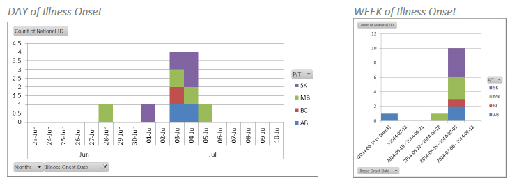
Epi Curve by Week of Illness Onset
7. In the grouping window, unclick all selected options (highlighted in navy blue) and choose Days and set the Number of days: to 7. Click OK.
8. In the PivotTable, you will notice that not all of the weeks from June 15 to July 12 show up. By default, dates with 0 cases have been hidden.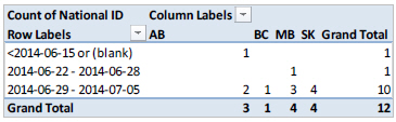
To view these dates, right-click any date in the PivotTable and select Field Settings…
In the Field Settings window, select the Layout & Print tab and check off the Show items with no data option. Click OK. The weeks ranging from June 22 to July 12 should now appear in the PivotTable. If you wish to see additional weeks, simply change the date ranges in the grouping window.

Continue to Step #12 to create the Epi Curve.
Epi Curve by Day of Illness Onset
9. In the grouping window, unclick all selected options (highlighted in navy blue) and choose Days and set the Number of days: to 1. Next, click the Months and then Years. Click OK.
10. You will notice that all dates from January are showing up. These can be hidden so that they do not show up in the Epi Curve. Scroll down to the dates where there are cases and highlight the area with data (in addition, few days before and after the first and last illness onset dates can be highlighted).
Since cases fall between June 28 and July 5, highlight the rows in the pivot table from June 23 to July 10. Right click the highlighted area and select Filter >> Keep Only Selected Items. Scroll up to see the data.

Creating the Epi Curve
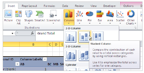
11. Highlight the PivotTable. Select the Insert tab on the ribbon. In the Charts section, select Column and then Stacked Column (second option in the 2-D Column section). A graph should appear. Resize as needed.
12. To remove the spaces between the bars, right click on any bar on the graph. Select Format Data Series. Under the Gap Width section, drag the slider to the very left to the No Gap side and click Close (alternatively, in the box below the Gap Width section, delete 150% and enter 0%).
The next few steps will help format the Epi Curve. The next steps do not have to follow the order listed, and are also optional formatting steps.
- Visual customizations
When the Epi Curve is selected, a new menu appears in the ribbon menu: PivotChart Tools. There are 4 menus to format and customize the Epi curve to look exactly the way you want it to. Key features in these 4 menus are listed below:- Design: Use the chart styles to choose the colours and outlines of the Epi curve.
- Layout: Modify labels and axes on your Epi Curve.
- Format: Modify specific colours and styles on your Epi Curve.
- Analyze: Refresh your PivotTable data to reflect on your Epi Curve.
- Removing/hiding rows that aren’t needed
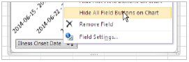
There are two rows that probably are not needed in your graph. For example, if you created an Epi Curve by Week: <2014-06-15 or (blank) and >2014-07-12. These can be removed in the Epi Curve by hiding them. In the PivotTable, click the drop down arrow beside Row Labels and uncheck them both. Click OK. - Remove the field buttons on the Epi curve
Right-click any of the Field Buttons on the Graph, select Hide All Field Buttons on Chart
- Adding Labels to the Epi Curve
- Axis Titles: Select the Epi curve. Under the PivotChart Tools in the top Ribbon, select the
Layout tab, and then the Axis Title.
(1) Select Primary Horizontal Axis >> Title Below Axis.
(2) Select Primary Vertical Axis >> Rotated Title.
After adding the titles in, select each on the Epi Curve, rename, and re-position as needed. Font types and sizes can also be modified by selecting the titles and using the Home menu tab. - Chart Title: Select the Epi curve. Under the PivotChart Tools in the top Ribbon, select the Layout tab >> Chart Title >> Centered Overlay Title or Above Chart. After adding the titles in, select each on the Epi Curve, rename, and re-position as needed. Font types and sizes can also be modified by selecting the titles and using the Home menu tab.
- Legend: Select the Epi curve. Under the PivotChart Tools in the top Ribbon, Select Layout tab >> Legend. Choose the location of your legend by playing around with 6 options available. The legend can also be manually moved and resized as needed. Font types and sizes can also be modified by selecting the titles and using the Home menu tab.
- Pre-chosen labels: Excel has a number of pre-chosen label options that can be used and then modified: PivotChart Tools >> Design >> Chart Layouts
- Axis Titles: Select the Epi curve. Under the PivotChart Tools in the top Ribbon, select the
- Formatting the Axes
- y-axis: Currently, your y-axis is in the default form (intervals of 2 if graphed by week or intervals of 0.5 if graphed by day). To change this to show intervals of 1, right-click the y-axis and select Format Axis. Under the Axis Options/Major Unit and Minor Unit, select Fixed, and enter 1.0 in the box. Select Close.
- x-axis: The x-axis is also in its default form. In the Week of Illness Onset graph, the x-axis is currently in a long date form. To rename this to your preference, select each row in the PivotTable and in the Formula Bar, replace the existing text with your preferred labels. Example: Select the cell that contains 2014-06-15 – 2014-06-21 in the PivotTable. Then, in the Formula Bar, delete the text and enter June 15. Repeat for all other labels.